.svg)

%20(1).avif)
Master Hacks: Migrate like a pro
Check out our video series to help you turn migration projects into masterpieces!
Table of contents
More broadly, it’s a tale of lessons learned during the year-long labor of love that was our rebranding project.

A major shift in the company’s positioning — one that came with new products and a new vision — brought along the need for us to redefine ShareGate’s messaging and visual identity. The final result is a representation of the work we’ve done over the past year on rethinking who we are, what we do, and how we do it.
As brand strategist at ShareGate, I took part in the rebrand from start to finish. This article will take you through some of the most important steps in the process and highlight the challenges and key takeaways of each one. I should note that this is entirely from my own perspective and doesn’t necessarily represent the opinion of others involved in the project.
Why we rebranded ShareGate
Before we get into the nitty-gritty, here’s a little background.
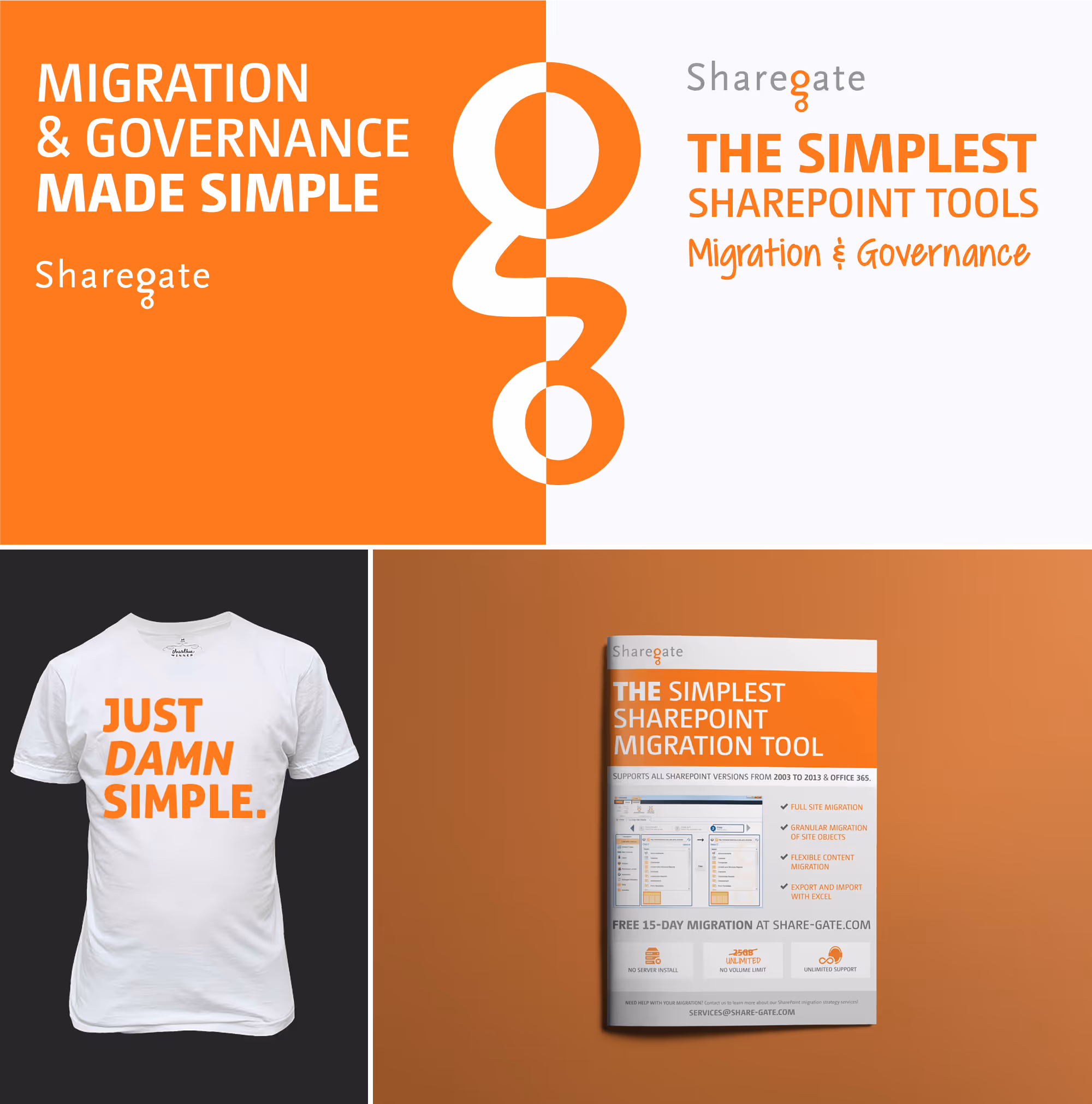
ShareGate was launched back in 2009 with one clear goal: be THE simplest SharePoint migration software on the market. That was the company’s focus for the longest time, and it paid off.
But 2009 was a long time ago. Our clients face different challenges today than they did in ShareGate’s earlier years.
We needed to come up with solutions to those challenges — i.e. develop new tools — in order to stay relevant in the long term. This context reshaped our vision for the company and kicked off ShareGate’s transition from stand-alone software to multi-product business. With such a dramatic shift, it only made sense to rethink our brand’s image and identity as a whole.
Enter: The ShareGate rebrand.
But first: what is a brand?
Yeah I know, you’re probably tired of reading articles on how “a logo is not a brand” — But just to make sure we’re all on the same page, here are some basic definitions for the words I’ll be using in this article.
When I say “brand”, I’m referring to ShareGate’s identity as a whole: our vision, our values, and the attributes that we promise and deliver in all the experiences we create for our users.
When I say “visual identity”, I’m referring to the visual expression of the ShareGate brand. The identifiable — the logos, illustrations, colors, typography, and other design elements that are distinctively ShareGate.
That’s it! Now let’s dive in.
Reevaluating who we are and what we stand for
Big changes were happening for ShareGate, but what exactly did those changes mean for the brand? Our company’s vision was evolving, and we needed to figure out who we really were before we could decide how to express that identity moving forward.
Internal interviews
We started by interviewing ShareGate employees from all departments. The goal was to collect their impressions regarding the brand — how was it before? How is it now? What do they see in ShareGate’s future? We wanted an overview of how the brand was perceived and communicated internally before moving on to the user interviews.
External interviews
We also wanted to know how our users perceived our brand, so we assembled a panel of individuals who’d interacted in different ways with the company: clients who love ShareGate, clients who were dissatisfied with ShareGate, at least one client who’d been with us for over a year, and consultants with whom we have a professional partnership. We asked them questions similar to the ones asked in our internal interviews in order to understand what they knew about us, how they saw our brand, and what they believed we should do next.
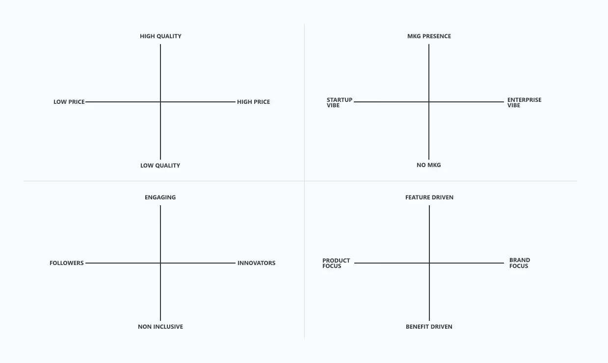
Competitive matrix
Based off of these interviews, we built a competitive matrix on which to position ourselves and all of our competitors — direct and indirect.
These are the axes we chose to base our comparisons on:
Spotting the patterns
Comparing the internal and external interviews and developing the competition matrix allowed us to identify ShareGate’s key differentiators. We looked at the words, ideas, and concepts that came up the most often throughout the process, which gave us major insights into how people currently perceived our brand. This groundwork helped us narrow down the direction we needed to take for the rest of the brand’s development.
For example, one thing that kept popping up in interviews was how incredible our technical support is. This made it clear to us that the ShareGate brand should highlight the support team. Our analysis also allowed us to confirm that we should continue to emphasize the notion of simplicity, which had been a major focus for ShareGate since the very beginning.

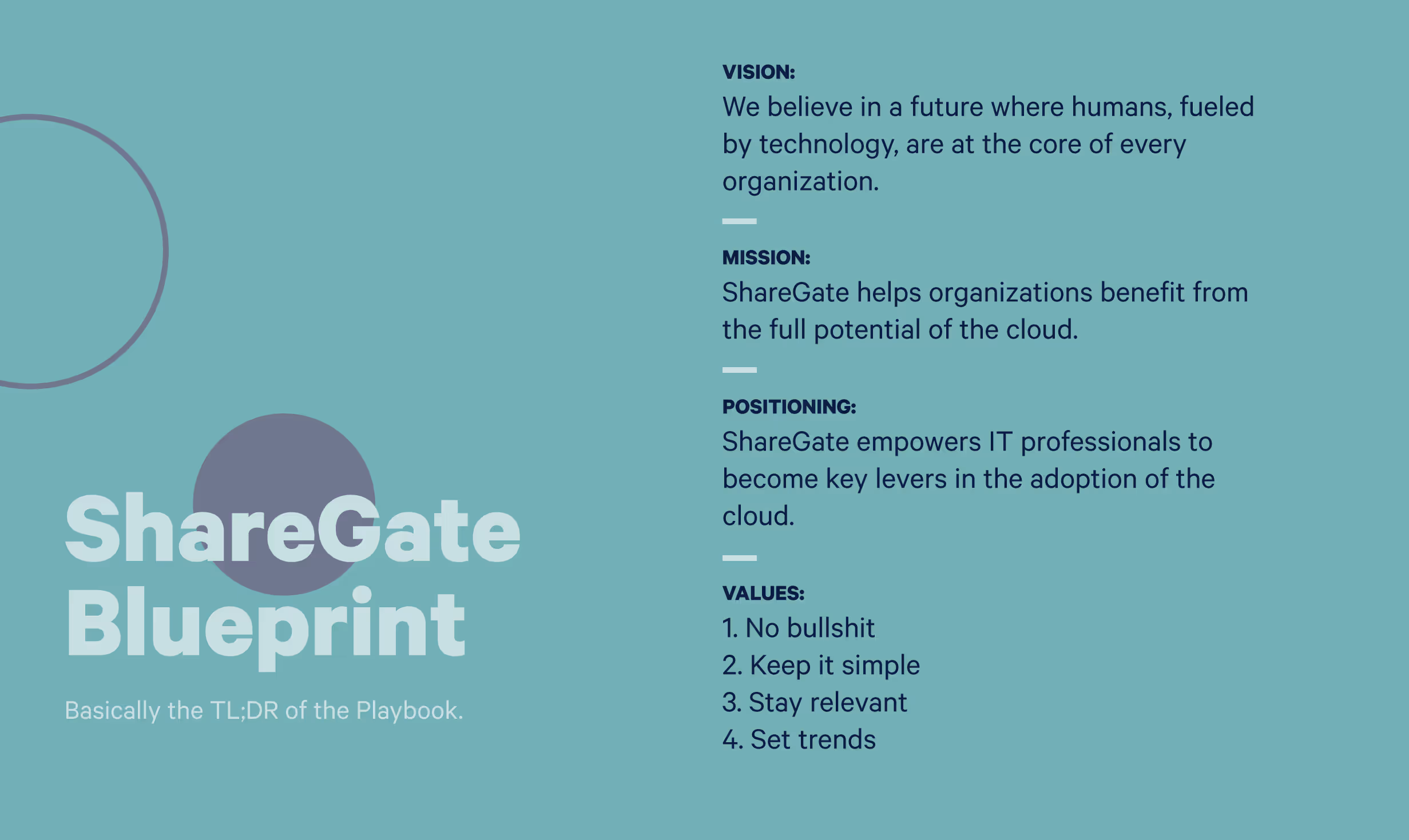
Brand blueprint and manifesto
Ultimately, all this research helped us build our brand blueprint, which is basically the backbone of ShareGate’s storytelling. It’s the brand at its simplest form: the vision, mission, positioning statement, and values, all listed in a one-pager format.
A brand blueprint should answer the following questions:
- Vision: What’s your brand’s BIGGEST dream/belief/goal?
- Mission: What mission will you give your brand in order to fulfil that ultimate goal or vision?
- Positioning: More concretely, what is your promise to your clients as you carry out this mission?
- Values: What guiding principles or commandments inform everything you do as a brand?
Building our brand blueprint ended up being a lot harder than we’d anticipated. If you’re having a hard time getting the right words onto paper, here are a few exercises that might help:
- Build your Golden Circle (if you’re not familiar with this exercise, be sure to watch Simon Sinek’s TEDx talk on the subject)
- Imagine your brand as a person. How would you describe their personality?
- Identify keywords in the transcripts of your interviews from step 1. Which adjectives were repeatedly used to describe your brand?
- Look up synonyms for all of the words you come out with. Sometimes you’ll stumble upon the perfect word for what you were trying to express.
Now that we had the backbone of our brand, we could write our manifesto. This was our chance to really tell our story — the one that explains why we do what we do, and who we do it for. We went through many different versions before we came up with the right narrative, which now serves as a North Star for everything we set out to create.
Lessons learned
- It’s easy to assume that you know best how to tell your brand’s story, but perception is a tricky thing. The way you see your brand could be totally different from what everyone else thinks. Don’t skip the interview phase! The insights gained could surprise you.
- Include key members of other departments in your brand blueprint brainstorm process. This is the core of your brand — marketing shouldn’t be the only team involved in its development.
- The blueprint is the structure of your brand, and the manifesto is the glue that holds it all together. They need to be based off each other for your brand to make sense!
Exposing our new brand messaging to the world
This was the beginning of something big — a new era for ShareGate. Exposing this new storytelling the right way was crucial.
We came up with a tagline based on our new positioning and plastered it all over our website, events, social media, emails…
I’d love to say that it was a huge success, but the truth is, it wasn’t. We were trying to sell an ideal, our big dream, to an audience that is very rational and analytical. We created too much of a gap between what we were saying and what we actually sold, so what we were communicating wasn’t understood by our audience.
Internally, we also didn’t give employees enough tools to assimilate the new brand messaging and communicate it properly, which led to an even bigger disconnect between what we saying and selling.
So, we went back to the drawing board, took the time to understand what words would truly resonate with our audience, and came up with a tagline that was closer to what we actually do.
Lessons learned
- Take the time to talk to your audience before choosing a tagline. The words that may resonate with you won’t necessarily work for them.
- Test a few different taglines based on your positioning before settling on one and plastering it everywhere. See if your users understand, and adjust if needed.
- Make sure you have all the tools you need to help employees understand and communicate the new brand.
Developing our visual identity
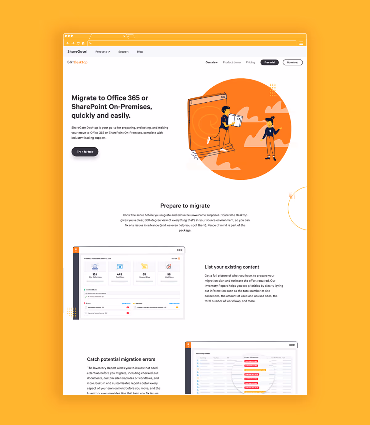
Now that we’d broadened our vision, we could finally expand our offering into an ecosystem of products with the ShareGate brand as its backbone. The team developed two more products to add to the ShareGate arsenal: ShareGate Overcast and ShareGate (more on the launch of our new products here) and renamed the original migration tool to ShareGate.

Our next challenge was developing a visual identity that would reflect our brand and be coherent in our new multi-product reality.
We knew we needed to bring in help for this right from the beginning — one does not simply create a visual identity for a brand and three products from scratch.
We chose Lg2, a local creative agency with a strong reputation in building brands. They helped us determine what we wanted and didn’t want design-wise, then set out to create a new identity that would be true to our core.
It was a long and arduous process, and we probably weren’t the easiest of clients, but in the end, we came out with a strong visual identity that truly communicates ShareGate’s new brand.
The ShareGate logo, shown here in its long and short versions, was fine-tuned to suggest simplicity. The brand’s main logo introduces and highlights the ShareGate product line.
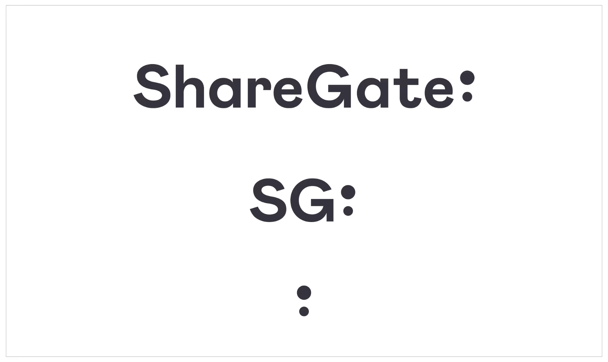
The two-dot symbol was developed in that same vein. Reminiscent of our previous logo with a subtle resemblance to a colon, it’s used in the full brand logo to introduce and highlight each of the products.
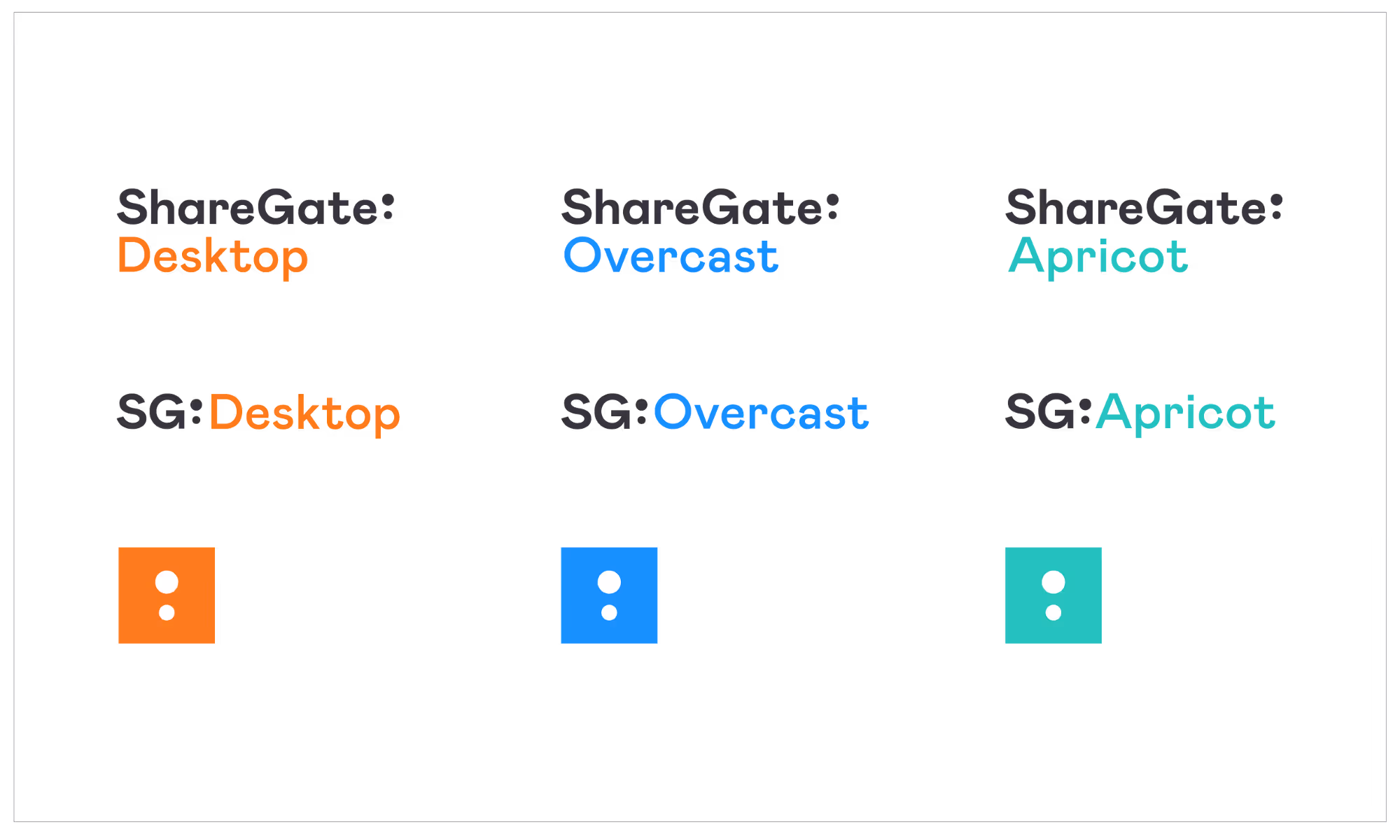
It also serves as a symbol, which is used sometimes alone, sometimes as part of the design environment — i.e. as a background illustration on a webpage.
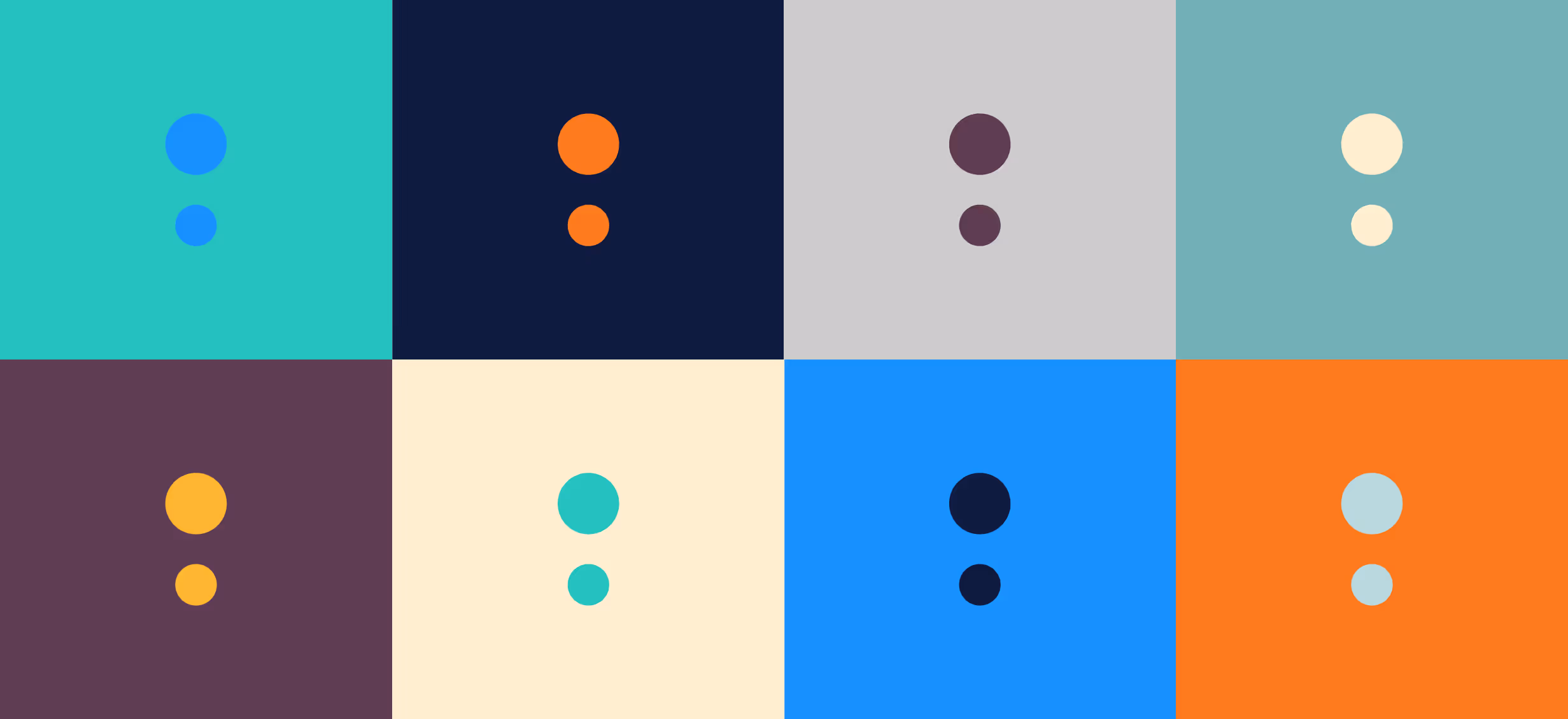
Each product has a primary color and an accent color. The accent colors are part of the brand color palette, so there’s always a reminder of the overlying ShareGate brand.

Lessons learned
- Don’t be afraid to get outside help. Sometimes we think we have all the answers, but having outsiders collaborate the project can give you visibility on potential gaps.
- Include people from different departments in your organization. This will help you cultivate internal ambassadors to spread the word and feedback you wouldn’t otherwise get.
- Working with external partners can be hard. Be patient and take the time to brief them thoroughly. Make sure they truly understand who you are and what you do.
The fun part
Once the visual identity was developed, the fun (but gigantic) part was making sure every single one of our assets was “on brand”. That meant redesigning our website, content, marketing and sales materials, and everything in between. In other words, it meant having fun with our new brand elements!
This is still an ongoing project. Depending on the size and age of your organization, there can be a lot to do. In our case, we’ll probably still be finding things that are off-brand two years from now, but we’ve dealt with the bulk of it.
Lessons learned
- Make an inventory of everything that needs to be changed before you start. It makes the task seem like less of a mountain.
- Try to change everything BEFORE you launch your new visual identity externally. That way you ensure maximum coherence in all your materials and can practice playing around with the new brand elements before exposing them to the world.
- Come to terms with the fact that some things will probably be readjusted in your new branding — a color change because the palette didn’t quite work on the website, a font change, etc. Things are never the same in theory and in practice!
The ultimate takeaway
A rebranding project is an emotional project. There will be people who won’t be happy, both within and outside of your business — people who were attached to “what you were before”. People who “hate that color” or who compare your branding to something they’ve already seen online. You can’t please everyone.
What’s important is to keep the purpose of the rebrand in mind and to care about the clients and employees that will live with it afterward. Don’t assume you know the right answer. Be vulnerable in this process and allow yourself to be proven wrong (or right…!).
Build a solid brand that makes sense for your business and your customers. Dream big!
This article was originally published on Medium.